The new customer
How tablets, smartphones and mobile technology are changing your buyers
Mobile technology is not only changing how dealers run their businesses, but also is radically reshaping the way customers shop.
It’s changed the buying process, the sales experience and how retailers can control the message. In other words, it’s a whole different ballgame.
 Google has coined the term “Zero Moment of Truth” to describe this change. The ZMOT is that moment when a shopper, in response to your traditional marketing “stimulus,” goes online to check you out – to read online reviews, to find out more about your products or simply to find out where you are located. (See sidebar, The Zero Moment of Truth.)
And more and more of that is happening on mobile devices. Morgan Stanley estimates that mobile searches will catch up with desktop searches in 2013 and surpass them in 2014.
Optimizing for mobile
The mobile customer is different than the desktop. These customers are looking for different information, they want it more quickly and, of course, the browsing experience is drastically different.
“The thing that has to be considered is the form factor,” says Cam Collins, president and CEO of Exuma Technologies, developer of DockMaster. “Especially on the smartphone, we’re talking about a very small piece of real estate. You have to completely rethink design.”
According to a recent Google survey, 55 percent of mobile users said a frustrating experience on a site hurts their perception of the brand.
Collins recommends having your designer use a responsive Web format that recognizes the device a user is on. Then, it will reformat the site and render the photos appropriately for that device. That way it is optimized whether the user is on a laptop, a smartphone, a 10-inch tablet or a 7-inch tablet.
Content also needs to be different. A common mistake companies make is trying to squeeze all of their desktop content onto that mobile site. Typically, users go to a mobile site with the goal of taking action.
“Contact information needs to be very prevalent from the very first page,” Collins says. “A lot of times when someone is searching on a mobile site they are looking to actually find the business. Whether it’s a phone number, whether it’s an email address, whether it’s a map to the physical location of the dealership, those things need to be readily accessible from the home page.”
The Google research backs that up. Finding out how to get to a business’s location is the top thing Web users are looking to do when they visit a mobile site – 76 percent cited it. They also want to contact that business – 61 percent want a “click to call” button on a mobile site and 54 percent want to be able to send an email directly from it.
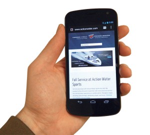
Making sure its website was mobile optimized was a key goal for Action Water Sports. It was one of the reasons the company redesigned its website last year. The Hudsonville, Mich.-based dealer recently won the Boating Industry Top 100 Best Website award.
“Our site is built in-house and takes advantage of the new responsive Web design standards that allows the site to move content around the page to best respond to the customer,” says general manager Jerry Brouwer. “If you view the site on a smartphone it will stack most of the content so you are not scrolling right or left.”

From Action Water Sports mobile site, users can access location info, make service appointments, search available parts, connect with social media and more.
The redesign has helped Action Water Sports improve its communication with clients, and while it’s difficult to measure, the company believes it is driving more business than the old, less flexible site.
How they buy
Think of how you consume information today. If you’re like most people, it’s very different than it was just a few years ago. It’s also likely on many different devices – often at the same time. Nearly 90 percent of consumers report using multiple screens – defined as a TV, desktop, laptop or mobile device during a given day – according to Google. Sixty-six percent say they use a smartphone and desktop or laptop simultaneously.
More often than not, when someone is looking for information about a business online, it’s a local business. Google points out that the average mobile user uses a local store locator function 63 times for every one mobile commerce order the user makes.
In general, that means a dealer needs to show up more often in more places with a marketing message – from a company website to video to social media to email newsletters to online review sites to traditional marketing. It’s about being part of the discussion.
Unfortunately, there is no hard data on how consumers have changed their approach to buying boats, but some recent research into the auto industry may provide some insight.
In its “Mobile Path to Purchase” study released in November, Nielsen found that those using mobile devices to research auto purchases tended to skew white and male, with the income group $75,000 to $100,000 representing the largest segment.
Some other insights from the Nielsen study:
• One out of every four mobile users are looking for local dealer information
• 51 percent of mobile researchers reported eventually making a purchase
• Smartphones were most often used for finding dealer locations; tablets were used more for research and finding pricing information
• Tablet users are also more likely to look at reviews and 3x as likely to be influenced by online reviews of dealerships


